What if?

What if you threw out the rules? What if you let the mandate go that says your photographs have to look "realistic"? What if you defy the requirement that your imagery has to look like it did when you were out there standing in front of the subject with a camera? What if you didn't worry about the sky being a neutral gray on a cloudy day or the right shade of blue on a sunny day? What if you chose to saturate the colors more, alter the palette or pump the contrast?
Why do you suppose this is a concern? Why are we afraid to break from reality in our work? We know photography lies, why do we work so hard to make it look "real"? I know one reason and that is that we've all seen work that is over saturated, over sharpened, over processed and over cooked and we know that it looks very very bad. In fact, this is one way someone like me decides if someone can print well or not.
This analogy might help: Back when I was teaching darkroom-based black and white photography, a standard routine for me was to stand in white light outside the darkroom, have intro students come out with their just processed wet prints in a tray to look so I could look at them. Invariably, students would print with too much contrast. My job was to say, "Print it flatter", making them go back in, change the variable contrast filter to a lower number in the enlarger, put another piece of paper in the easel, expose the print to light and process it through the chemistry, then bring the new print out for me to see and usually say, again, "Print it flatter." Intro students care about impact and contrastier can look sharper too. Subtlety? Not so much. My job was to show them that the real guts and substance of a photograph exist in the mid tones and that printing with too much contrast usually resulted in eliminating detail and information contained in the negative. I used to tell students not to "print with a sledgehammer." You get my point.
So, to bring this up to the present, this is our holdover from earlier times or perhaps our albatross. Traditionally, good printers do not draw attention to the print itself but to the image contained within it, hence the "realistic" overriding rule. I believe this to be fundamentally correct in documentary and photojournalistic photography, where verisimilitude is essential for believability and accuracy and where the person taking the picture is secondary to the event, but in art? Why would art require accuracy? It is art.
Now, I am not crazy and I am not going to go into too much "warm and fuzzy" here in a blog that goes out to the public but I hope you get my point. Worried about what others will think or feel strongly about an image and the color palette it exists in? Know you are right or are you concerned that you will be invalidated due to how much or what hue you dial in for your prints? Yes, I am an advocate of informed decisions and, if you are just starting out, by all means drive your pictures more to the color accuracy end of the spectrum but remember, you are making art, right? Drive it any way you want. It's your art.
Let's see what you think:


This is simply working with a pallete of colors.
I started out in my career (44 years ago) as an artist by studying and wanting to be a painter. During my student years I spray painted large canvasses of horizon-based landscapes in bright colors. I was quite successful but I was taking photography courses at the same time as I was painting. Although photography won me over it is somewhat ironic that I was a colorist as a painter, then, while a photographer for the next 30 years, I stayed within the discipline of black and white. Now, back to being a colorist.
Related series
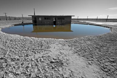
Salton Sea, CA 2012
I made these pictures in the winter of 2012. Although the use of color in this way isn’t new I wanted to emphasize the bizarre color of the bodies of water near the edge of the lake. The Salton Sea is a man made disaster of epic proportions and I felt an unconventional approach was appropriate here.
The prints are 21 x 14 inches
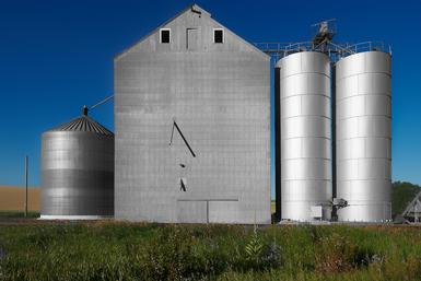
Grain Silo, Washington 2012
These photographs were made while in Washington photographing Wheat. This series continues a way of working begun with the Salton Sea, CA photographs made the winter of 2012. This method combines black and white and color.
The prints in this portfolio are 21 x 14 inches