PRINTING
![]()
This one's going out to those of you that print your own photographs. There may be information in here that might help you if you send your files out to be printed by someone else, but principally this post will be for photographers that make their own inkjet prints.
It seems few make their own prints anymore, that printing has been relegated to a non-creative process, to a "technician" to translate the original files into a two dimensional representation on a piece of paper. But if you're an artist doesn't this seem a little bit skewed? It does to me.
As a career teacher I get that people struggle a great deal with making good prints. It can be very challenging. In darkroom days it often took students a whole semester to learn how to make a good print. But it doesn't have to be such agony. Let's start with the tools you are working with.
A reasonably capable computer is good, one that can handle your multiple files and that either has enough internal storage or enough external storage in RAIDS or hard drives not to get bogged down. I am an advocate of keeping up to date, within reason, on Operating Systems and updated firmware as to fall behind means you might get locked out of some applications. Knowing Photoshop and your file management system, usually Lightroom these days, is also a prerequisite.Take a class if necessary to become skilled in these.
Your choice of printer probably means less than you think. Of course, maximum print size is the primary issue. How big do you need to print? Several of my friends don't print large, usually. For that special situation when they need something larger, they go to a lab or a friend who has a big printer. For most that makes sense as big prints are a pain; hard to handle, difficult to look at unless tacked up or framed, expensive and difficult to store. Don't get me started as I make many large prints. On the other hand a 5 or 6 foot print can be simply breathtaking if the quality is high.Whatever printer you are using should not have clogged nozzles, not have a terminal disease, and be clean and not destroying the paper you run through it. It does not have to be the newest one out there as long as it is healthy. Finally, the paper you choose is a topic for a whole workshop, let alone a short blog but suffice it to say that almost any paper is capable of making an excellent print. Also, you do get what you pay for with papers. If demand is high for a breakdown of papers I can go into this in a new post. Let me know.
Your workflow needs to be fluid and known. Work out a logical system for your- self. It is important that you be somewhat systematic. Can you get back to the file at a later time? Is your filing system understandable and organized? I make RTP files that sit in the project's folder. RTP means Ready to Print and this means the files in that folder are color corrected, sized, sharpened, cleaned if necessary and ready to be sent to the printer.
Monitors and calibration. The quality (and size) of your display is another important part of the equipment you use to make prints. I used Eizo's for years but have two different ones that I use now. My primary monitor is a Sharp PN-K321 which is 32 inches and very good. When on the road I usually bring a Apple Thunderbolt large display that I use with a Mac laptop computer. This is a reasonably good display and a lot cheaper as well. There is a great deal written about calibration and I am a believer, particularly when setting up a new monitor. Flat panel displays drift far less than older monitors but still they do age.
Also, be aware of the light in the room where you work. It shouldn't be too light or too dark. Also be careful to provide a viewing light to evaluate your prints. This should be close to daylight, not too warm(yellow) or too cold (blue).
Finally, to one of my main points: Closed Loop System(CLS). What's this?
A CLS of your own is self contained and holds few variables. CLS is your system taken as a whole, familiar and predictable, because you don't impose something new to it, at least not very often. Take your RTP file to someone else to print and you are now in an Open Loop System (OLS), meaning you are interjecting unknowns into your final results. CLS uses components that are yours, that you've debugged, calibrated and worked with over time. This makes problem solving easier and often results in superior prints. However, CLS means you are responsible for it all, including stocking the inks and papers needed. I went into this a little in my blog on Bob Korn Imaging (here). Part of Bob's expertise is his knowing how to get a great print from your file. Send your file off to someplace you don't know and can't speak with and who knows what will happen to your photograph. Clearly I am not a big fan of distant large printing companies with anonymous operators. Buy local here if you don't make your own.
ICC (International Color Consortium) profiles. Important? Yes. Don't know what these are? These are used to key your printer to the kind of paper you are using. This isn't hard. Do the research and use them as they will affect your prints.
What else? Be patient. Great printing takes time to learn. Define your work as if you were a student, learning from your mistakes. You need to teach your eye/brain combination just what a really good print looks like. Look at lots of prints, judge them critically. Common mistakes: weird and overworked files that are oversaturated for impact and over sharpened because people think more is better. Take a class, a weekend workshop or a day long immersion into printing. But make sure the person teaching it knows what they are doing. Don't follow a false prophet. Be prepared to blow some materials in your pursuit for perfection. Do good printers make the best print the first time? Hardly. For me, I am always trying to do that, for my first print to be magnificent. But it seldom happens. Same was true in the darkroom. No differents now that I make my prints with a computer and an inkjet printer.
Look, good printing is a skill. It takes real ability to make a good print from such a wide array of hardware and software, a massive amount and yes's or no's or on's or off's in this digital world that it is a wonder we can get the results we do. So, it is a science. But it also is an art, needing great sympathy and empathy for the original intent to come to fruition, a sensitive person that interprets and uses the tools that are available to mold, meld and make a print that is evocative and expressive. Who knows that better than the person clicking the shutter in the first place? Committed to your work? Then show that commitment by getting serious about your prints. Even if you don't make prints yourself, knowing printing informs you as to what is needed from the person you choose to make your prints.
Making beautiful prints of your imagery? Lost art? Doesn't have to be.
Related series
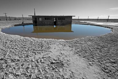
Moab, Utah 2010
In the sping, 2010, while on sabbatical leave from my teaching position, I spent three weeks in Moab. I had been through there years before, and had photographed in black and white 8 x 10, but had never spent more than a couple of days there. It was wonderful. Moab gets very very hot in the summer but in March it is perfect. The days were long and the temperature cool at night. I drove, hiked and photographed. I also shot aerials (some of those you can see in the Rock Sand and Water series).
The final portfolio from Utah is about 25 prints made on 25 x 17 inch Harmon paper.
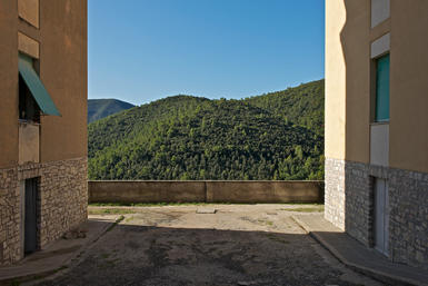
Mountain Work 2011
Mountain Work is a group of photographs made over a two year period and combine work I did in Italy, Utah, Vermont, New Hamshire and California.
The prints are @ 23 x 15 inches and are archival inkjet prints.

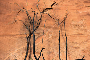
Trees, Italy 2009
These were made in 2009 on a sabbatical leave from my teaching position at Northeastern University. Driving from Venice to stay in Trieste for three weeks, I came across these stands of trees, interspersed among fields of wheat and corn, in a flat agricultural region near small towns with names like Latisana and Palmonova.
Digital capture is in color, so I made the conversion to black and white in post production, using Photoshop so that I was able to make these as duotones. The inkjet prints are 21 x 14 inches.
I returned to Trieste in the fall of 2012 and photographed the trees again, this time keeping them as color photographs.